Using Heatmaps to Improve Your Website’s UX: Best Heatmap Tools 2026
Using Heatmaps to Improve Your Website’s UX: Best Heatmap Tools 2026
Using Heatmaps to Improve Your Website’s UX: Best Heatmap Tools 2026
Table of Content
Title


Ashish Khatri
Ashish Khatri
Ashish Khatri
Web Design
Web Design
Web Design
12 Min Read
10 Min
12 Min Read
Understanding how users behave on your website has become one of the biggest competitive advantages in UX and conversion optimization. A design may look polished during planning, but real users often interact with websites in unexpected ways — missing important sections, clicking the wrong elements, or abandoning pages earlier than you expect.
This is where heatmaps step in.
Heatmaps capture real behavior (clicks, taps, scroll depth, and movement tracking), giving you a visual understanding of what users actually do—not what you think they do. By analyzing these patterns, teams can identify friction points, improve navigation, redesign content layout, and make informed UX decisions.
Heatmaps turn intuition into evidence. They replace guesswork with clarity and help you understand what users notice, ignore, or struggle with. Today, UX designers, product teams, marketers, developers, and growth specialists rely heavily on heatmaps because:
Insights are visual and extremely intuitive
No technical knowledge is required
They reveal hidden behavior patterns
They highlight why users drop off
They validate whether a design is working as intended
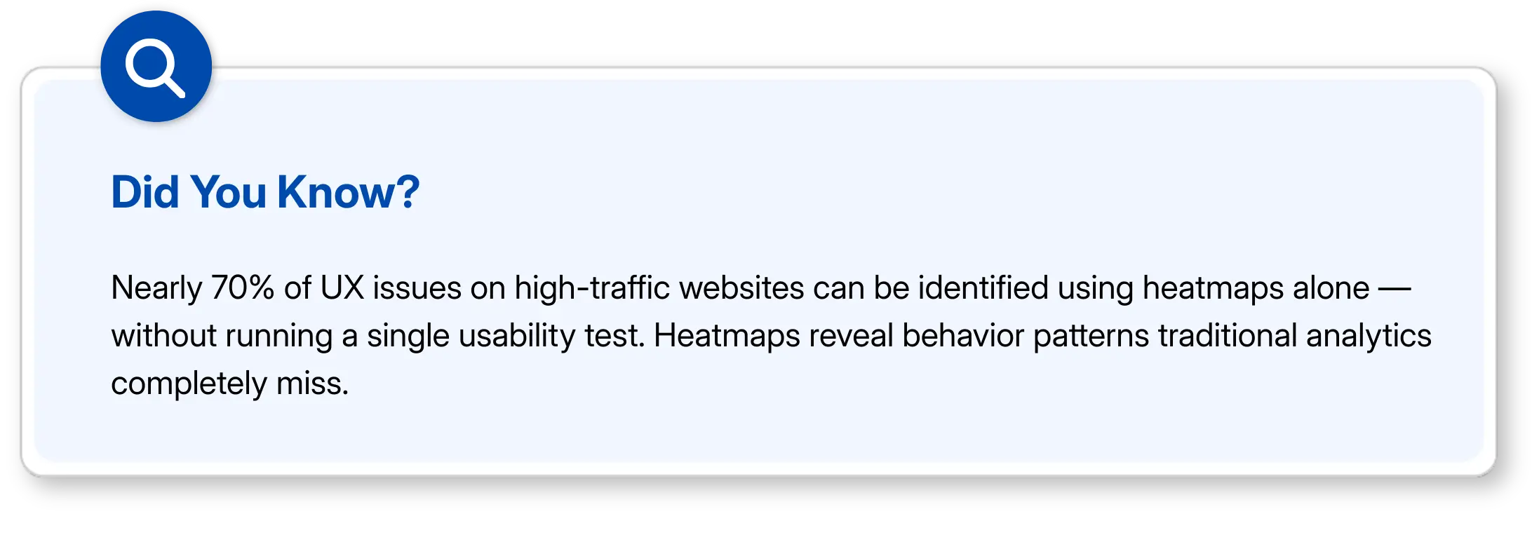
In 2026, heatmaps are not just “good to have” — they’re essential. Below is a complete guide on how heatmaps improve UX, how they pair with A/B testing, and a detailed look at the best heatmap tools used by companies in 2026.
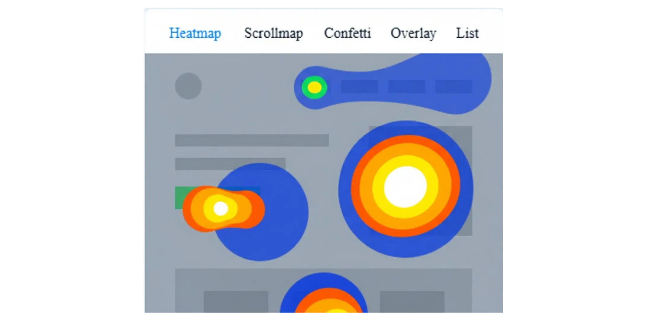
What Exactly are Heatmaps?
A heatmap is a visual representation of user interactions on your website. The areas where users engage the most appear in “hot” warm colors like red, orange, and yellow. Low-engagement areas show up in cooler shades like blue and green.
Heatmaps help you instantly see:
Where users click
How far they scroll
Which sections get the most attention
What elements are ignored
Where users experience frustration.
These visual insights help you uncover barriers to conversion and opportunities for improvement.
Best Heatmap Tools that Companies Are Using in 2026
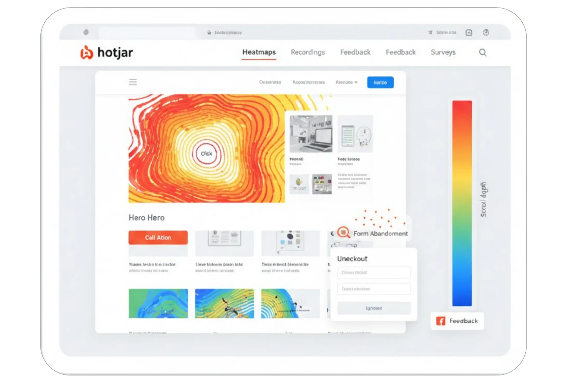
1. Hotjar
Hotjar happens to be one of the most usable heatmap tools since it is simple and works well for teams of any size. It gives click, move, and scroll heatmaps along with session recordings. Many designers say Hotjar helps them see why users abandon forms or ignore CTAs. It has inbuilt surveys and feedback widgets that help you connect heatmap data with real comments. Most e-commerce stores and SaaS companies use Hotjar because it feels easy and does not require complex setup.
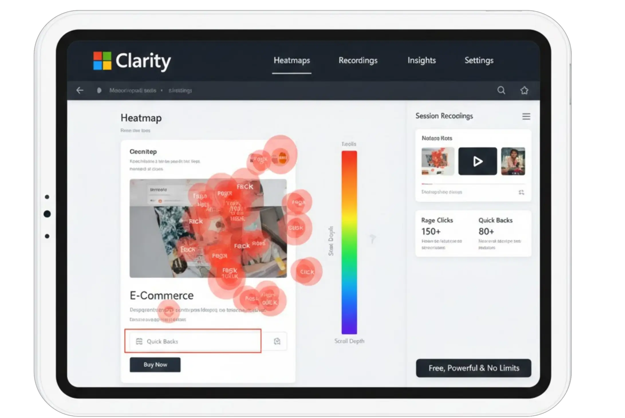
2. Microsoft Clarity
Microsoft Clarity is popular mainly because it is free and yet powerful. It provides detailed heatmaps and session recordings without limits, which makes it great for startups and mid-size businesses. Many UX teams use clarity to track rage clicks and quick backs that highlight frustration. Since it runs smoothly and doesn't slow down the site it has become a favorite for developers too. More Shopify and WooCommerce stores have started using Clarity as their first heatmap tool.
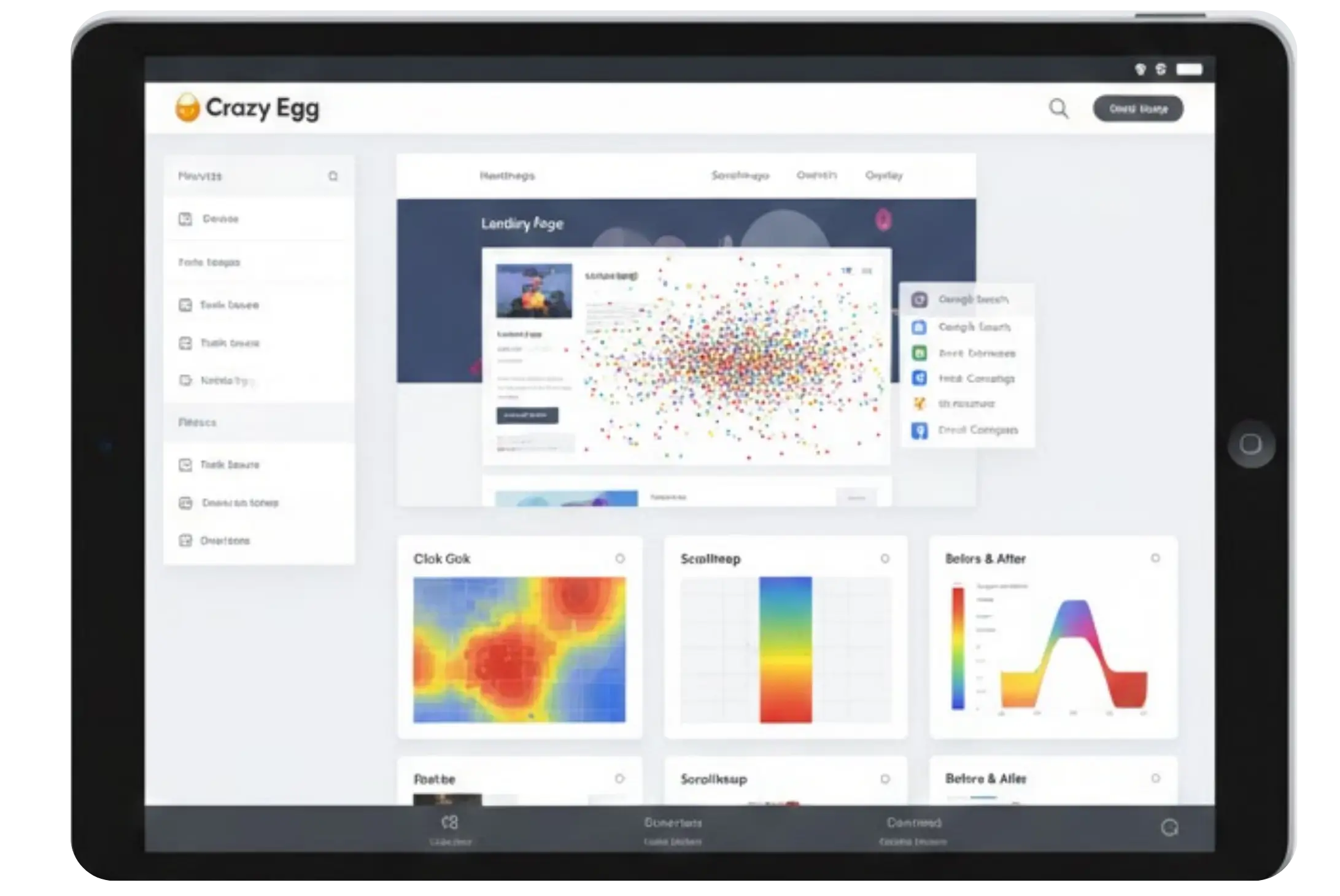
3. Crazy Egg
Crazy Egg is renowned for its visual reports. It has to offer click heatmaps, scroll maps, and a very useful Confetti view. Confetti lets you visualize traffic behavior based on referral source, something that feels extremely useful during bigger marketing campaigns. A lot of agencies use Crazy Egg to test landing pages because it shows clear visual changes before and after edits. The tool is relatively straightforward, making it great for teams that want quick insights without learning new systems.
4. Smartlook
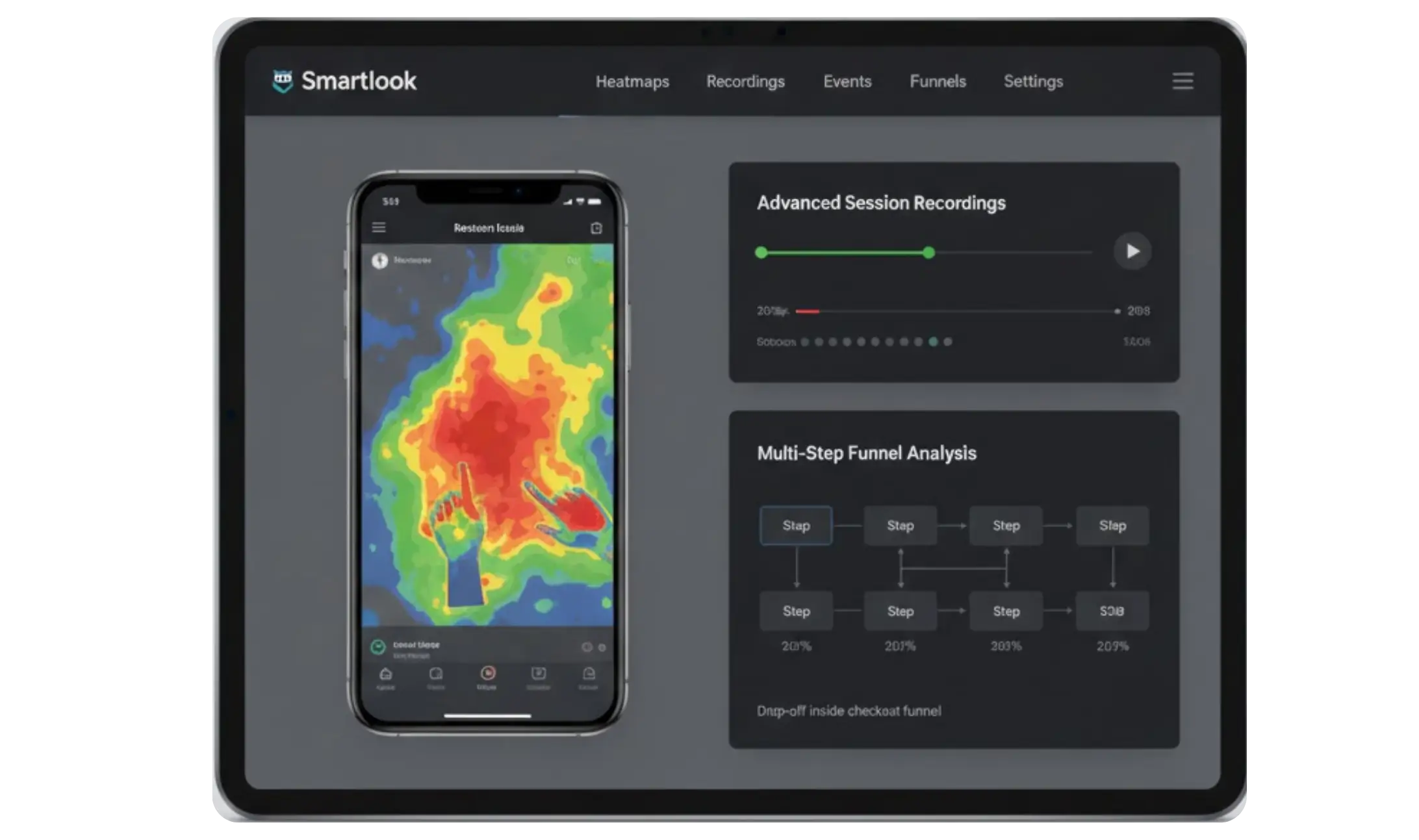
Smartlook works great for product and mobile app teams. Besides heat maps, it allows event tracking and advanced session recordings that let teams understand very specific problems like drop-offs inside multi-step funnels. Many app-based companies prefer Smartlook because it works both on websites and mobile apps, which means it gives a complete view of user behavior. If you want deeper UX research, then Smartlook is a strong choice.
5. Plerdy
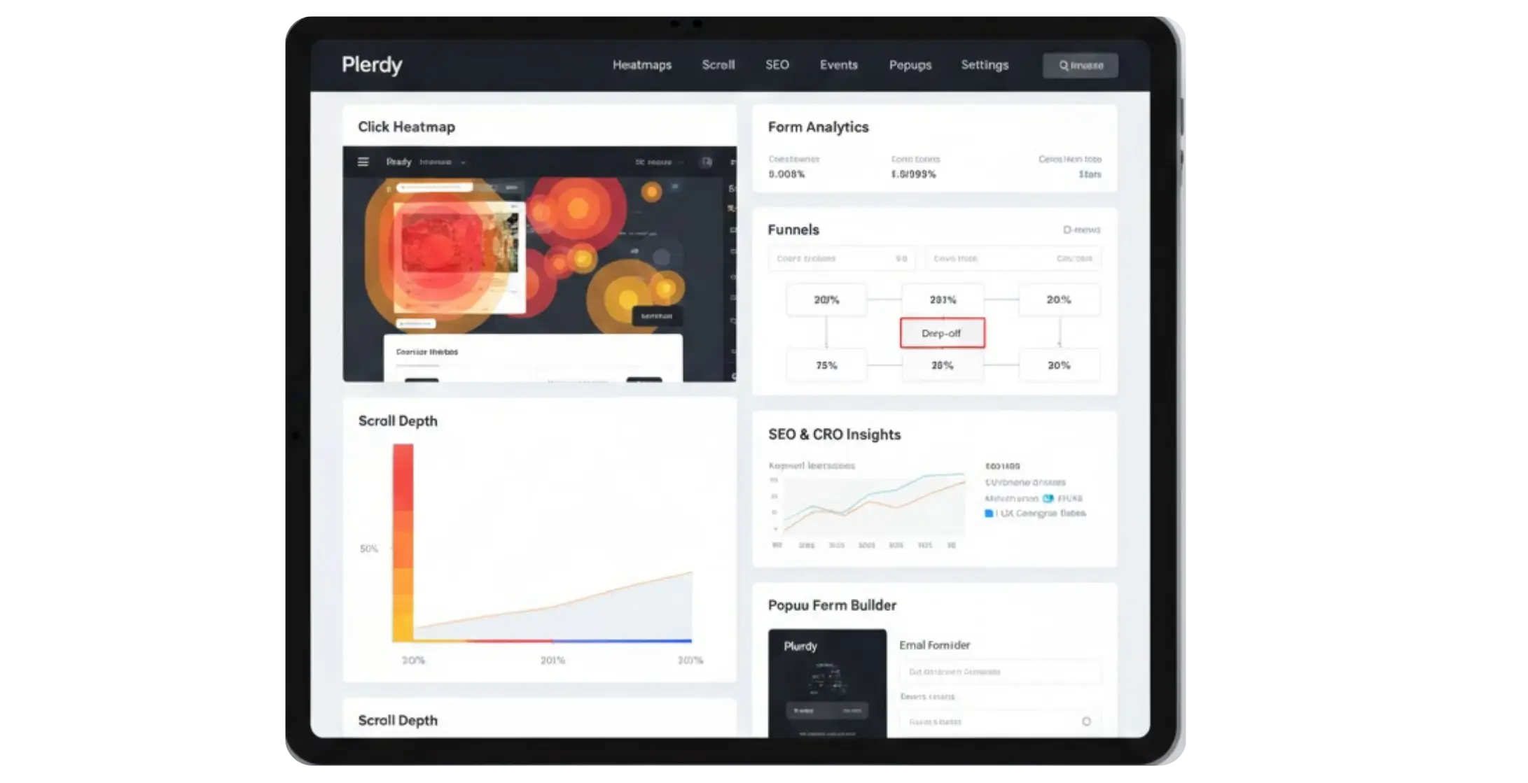
Plerdy is used quite a lot by SEO and CRO specialists. Click heatmaps, scroll depth reports, form analytics, and funnel tracking are provided by it. Companies choose Plerdy since it helps them get insights into how UX affects conversions and keyword performances. Real users say that Plerdy does make micro interactions easier to track on a very long page. It also has popup forms and other marketing tools, which many ecommerce brands like.
6. Contentsquare
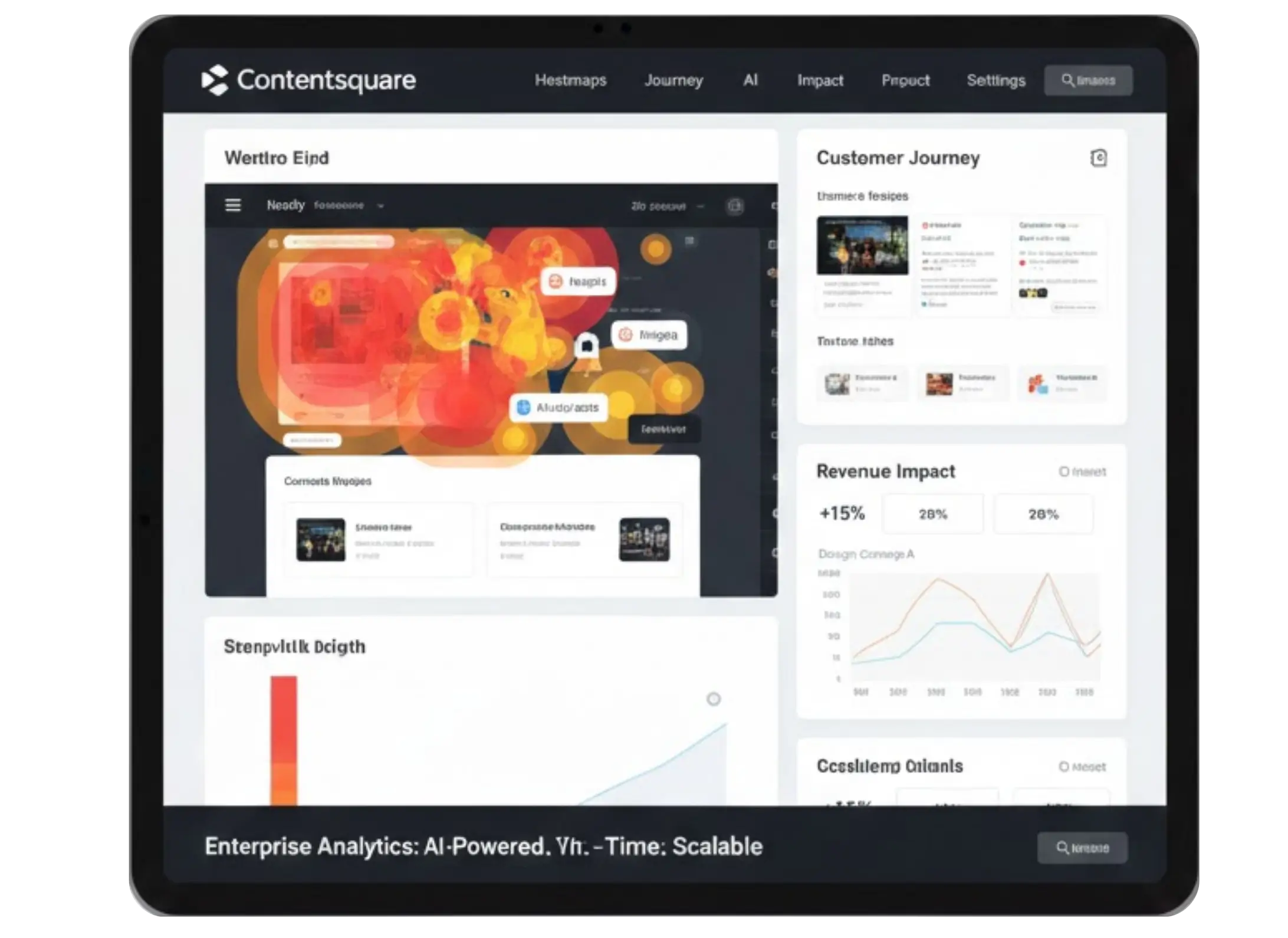
Contentsquare is a more advanced enterprise tool used by large brands. It provides detailed heatmaps with AI-driven insights. Teams use it to understand complex customer journeys and to connect heatmap data with revenue. Contentsquare feels powerful for companies that want deep behavioral analytics across many pages and products. It can show how design changes affect sales in real time; hence, big organizations are adopting it in 2026.
Why Heatmaps Matter for UX and Conversions
Heatmaps offer direct visual proof of what’s working and what needs attention. Here’s how they help improve UX:
1. Identify Misplaced CTAs: If your call-to-action button is not being noticed or clicked, heatmaps show exactly where users look — and where they don’t.
2. Reduce Scroll Friction: Scroll heatmaps reveal where users stop scrolling. If important content sits below the drop-off line, you know it must be moved upward.
3. Improve Navigation Structure: When users struggle to find key links, movement heatmaps highlight hesitation points or excessive cursor travel.
4. Optimize Product Pages: If visitors ignore specs, benefits, or reviews, you can reorganize the layout to make key information more visible.
5. Spot User Frustration: “Rage clicks,” dead clicks, and repeated interactions with non-clickable elements highlight usability problems.
6. Validate A/B Test Ideas: Heatmaps reveal “why” a variation is winning or losing—making your optimization decisions more data-driven.
In short, heatmaps transform behavioral data into actionable design improvements.

Using Heatmaps with A\B Testing for Smarter UX Decisions ever
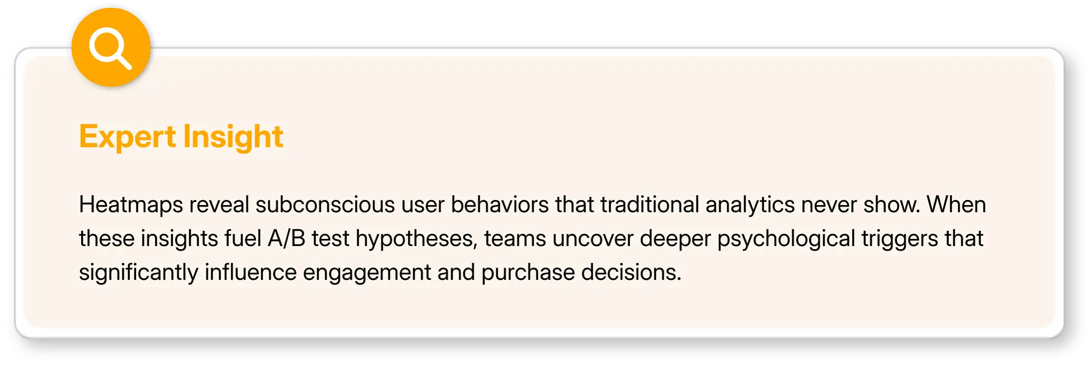
Heatmaps become even more powerful when you pair them with A\B testing. The two work well together because heatmaps show you what users are doing right now while A\B tests help you confirm which change performs better. Many teams use heatmaps first to spot issues such as ignored CTAs or low scroll depth. Once they understand the problem, they create two versions of the page and test them against each other.
For example, you might see that users stop scrolling before the product benefits section. You can run an A\B test that moves this section higher on the page. After the test runs, you can use new heatmaps to see how users behave on each version; this gives you a clear picture of what improved and what still needs work. It removes guesswork and helps you make confident decisions based on real behavior.
Product teams, marketers, and e-commerce owners often say that heatmaps guide their test ideas while A\B testing validates those ideas. When both tools are used together, the UX process becomes smoother because every change has a reason behind it. You make small adjustments that add up to stronger engagement and better conversions.
Final Thoughts
Heatmaps remain one of the easiest ways to understand real user behavior on your website. When you combine heatmaps with A/B testing, changes are done based on data instead of guesses. This leads to better navigation and stronger conversions. The tools available in 2026 make it easy for teams to get simple yet powerful insights without complicated setups. Be it a small store or a large digital platform, heatmaps show what works and what needs attention. When you learn to read these patterns, then your UX improves and your users feel more confident on your site. Contact us today to turn heatmap data into actionable UX and CRO improvements.
Understanding how users behave on your website has become one of the biggest competitive advantages in UX and conversion optimization. A design may look polished during planning, but real users often interact with websites in unexpected ways — missing important sections, clicking the wrong elements, or abandoning pages earlier than you expect.
This is where heatmaps step in.
Heatmaps capture real behavior (clicks, taps, scroll depth, and movement tracking), giving you a visual understanding of what users actually do—not what you think they do. By analyzing these patterns, teams can identify friction points, improve navigation, redesign content layout, and make informed UX decisions.
Heatmaps turn intuition into evidence. They replace guesswork with clarity and help you understand what users notice, ignore, or struggle with. Today, UX designers, product teams, marketers, developers, and growth specialists rely heavily on heatmaps because:
Insights are visual and extremely intuitive
No technical knowledge is required
They reveal hidden behavior patterns
They highlight why users drop off
They validate whether a design is working as intended
In 2026, heatmaps are not just “good to have” — they’re essential. Below is a complete guide on how heatmaps improve UX, how they pair with A/B testing, and a detailed look at the best heatmap tools used by companies in 2026.
What Exactly are Heatmaps?
A heatmap is a visual representation of user interactions on your website. The areas where users engage the most appear in “hot” warm colors like red, orange, and yellow. Low-engagement areas show up in cooler shades like blue and green.
Heatmaps help you instantly see:
Where users click
How far they scroll
Which sections get the most attention
What elements are ignored
Where users experience frustration.
These visual insights help you uncover barriers to conversion and opportunities for improvement.
Best Heatmap Tools that Companies Are Using in 2026
1. Hotjar
Hotjar happens to be one of the most usable heatmap tools since it is simple and works well for teams of any size. It gives click, move, and scroll heatmaps along with session recordings. Many designers say Hotjar helps them see why users abandon forms or ignore CTAs. It has inbuilt surveys and feedback widgets that help you connect heatmap data with real comments. Most e-commerce stores and SaaS companies use Hotjar because it feels easy and does not require complex setup.
2. Microsoft Clarity
Microsoft Clarity is popular mainly because it is free and yet powerful. It provides detailed heatmaps and session recordings without limits, which makes it great for startups and mid-size businesses. Many UX teams use clarity to track rage clicks and quick backs that highlight frustration. Since it runs smoothly and doesn't slow down the site it has become a favorite for developers too. More Shopify and WooCommerce stores have started using Clarity as their first heatmap tool.
3. Crazy Egg
Crazy Egg is renowned for its visual reports. It has to offer click heatmaps, scroll maps, and a very useful Confetti view. Confetti lets you visualize traffic behavior based on referral source, something that feels extremely useful during bigger marketing campaigns. A lot of agencies use Crazy Egg to test landing pages because it shows clear visual changes before and after edits. The tool is relatively straightforward, making it great for teams that want quick insights without learning new systems.
4. Smartlook
Smartlook works great for product and mobile app teams. Besides heat maps, it allows event tracking and advanced session recordings that let teams understand very specific problems like drop-offs inside multi-step funnels. Many app-based companies prefer Smartlook because it works both on websites and mobile apps, which means it gives a complete view of user behavior. If you want deeper UX research, then Smartlook is a strong choice.
5. Plerdy
Plerdy is used quite a lot by SEO and CRO specialists. Click heatmaps, scroll depth reports, form analytics, and funnel tracking are provided by it. Companies choose Plerdy since it helps them get insights into how UX affects conversions and keyword performances. Real users say that Plerdy does make micro interactions easier to track on a very long page. It also has popup forms and other marketing tools, which many ecommerce brands like.
6. Contentsquare
Contentsquare is a more advanced enterprise tool used by large brands. It provides detailed heatmaps with AI-driven insights. Teams use it to understand complex customer journeys and to connect heatmap data with revenue. Contentsquare feels powerful for companies that want deep behavioral analytics across many pages and products. It can show how design changes affect sales in real time; hence, big organizations are adopting it in 2026.
Why Heatmaps Matter for UX and Conversions
Heatmaps offer direct visual proof of what’s working and what needs attention. Here’s how they help improve UX:
1. Identify Misplaced CTAs: If your call-to-action button is not being noticed or clicked, heatmaps show exactly where users look — and where they don’t.
2. Reduce Scroll Friction: Scroll heatmaps reveal where users stop scrolling. If important content sits below the drop-off line, you know it must be moved upward.
3. Improve Navigation Structure: When users struggle to find key links, movement heatmaps highlight hesitation points or excessive cursor travel.
4. Optimize Product Pages: If visitors ignore specs, benefits, or reviews, you can reorganize the layout to make key information more visible.
5. Spot User Frustration: “Rage clicks,” dead clicks, and repeated interactions with non-clickable elements highlight usability problems.
6. Validate A/B Test Ideas: Heatmaps reveal “why” a variation is winning or losing—making your optimization decisions more data-driven.
In short, heatmaps transform behavioral data into actionable design improvements.
Using Heatmaps with A\B Testing for Smarter UX Decisions ever
Heatmaps become even more powerful when you pair them with A\B testing. The two work well together because heatmaps show you what users are doing right now while A\B tests help you confirm which change performs better. Many teams use heatmaps first to spot issues such as ignored CTAs or low scroll depth. Once they understand the problem, they create two versions of the page and test them against each other.
For example, you might see that users stop scrolling before the product benefits section. You can run an A\B test that moves this section higher on the page. After the test runs, you can use new heatmaps to see how users behave on each version; this gives you a clear picture of what improved and what still needs work. It removes guesswork and helps you make confident decisions based on real behavior.
Product teams, marketers, and e-commerce owners often say that heatmaps guide their test ideas while A\B testing validates those ideas. When both tools are used together, the UX process becomes smoother because every change has a reason behind it. You make small adjustments that add up to stronger engagement and better conversions.
Final Thoughts
Heatmaps remain one of the easiest ways to understand real user behavior on your website. When you combine heatmaps with A/B testing, changes are done based on data instead of guesses. This leads to better navigation and stronger conversions. The tools available in 2026 make it easy for teams to get simple yet powerful insights without complicated setups. Be it a small store or a large digital platform, heatmaps show what works and what needs attention. When you learn to read these patterns, then your UX improves and your users feel more confident on your site. Contact us today to turn heatmap data into actionable UX and CRO improvements.
Ashish Khatri
, Project Analyst
Ashish is a Client Success Manager who connects client goals with team delivery on digital projects and marketing campaigns. He works directly with clients and teams across product, design, SEO, and development to keep projects on track and build strong relationships. His focus on clear communication, smooth processes, and client satisfaction helps consistently deliver reliable results.


Latest Blogs


Don’t miss our revenue growth tips!
Get expert marketing tips—straight to your inbox, like thousands of happy clients.
Don’t miss our revenue growth tips!
Don’t miss our revenue growth tips!
Get expert marketing tips—straight to your inbox, like thousands of happy clients.
Don’t miss our revenue growth tips!
Get expert marketing tips—straight to your inbox, like thousands of happy clients.
Relevant Blogs on Web Design
Relevant Blogs on Web Design
Unlock data-driven insights in Web Design—explore our featured blogs and skyrocket your revenue before your competitors do.
Unlock data-driven insights in Web Design—explore our featured blogs and skyrocket your revenue before your competitors do.

Web Design
Web Design
10 Min Read
10 Min Read
The Ultimate Guide to Choosing Your E-commerce Platform

Web Design
Web Design
12 Min Read
12 Min Read
What Is Keyword Cannibalization? How It’s Hurting Your Website (And How to Fix It)
Web Design
Web Design
10 Min Read
10 Min Read
Walmart vs. Amazon: Differences , Profitability and Why We Shouldn't Ignore


Ready to speak with an expert?
Data-Driven Marketing Agency That Elevates ROI
1100+
Websites Designed & Optimized to Convert
$280M+
Client Revenue Driven & Growing Strong
Discover how to skyrocket
your revenue today!


Trusted by 1000+ Owners!
Ready to speak with an expert?
Data-Driven Marketing Agency That Elevates ROI
1100+
Websites Designed & Optimized to Convert
$280M+
Client Revenue Driven & Growing Strong
Discover how to skyrocket
your revenue today!
Trusted by 1000+ Owners!
Want to skyrocket revenue?
4.9/5 Ratings!
Ready to speak with an expert?
Data-Driven Marketing Agency That Elevates ROI
1100+
Websites Designed & Optimized to Convert
$280M+
Client Revenue Driven & Growing Strong
Want to skyrocket
revenue?
Trusted by 1000+ Owners!
Call
Meet

